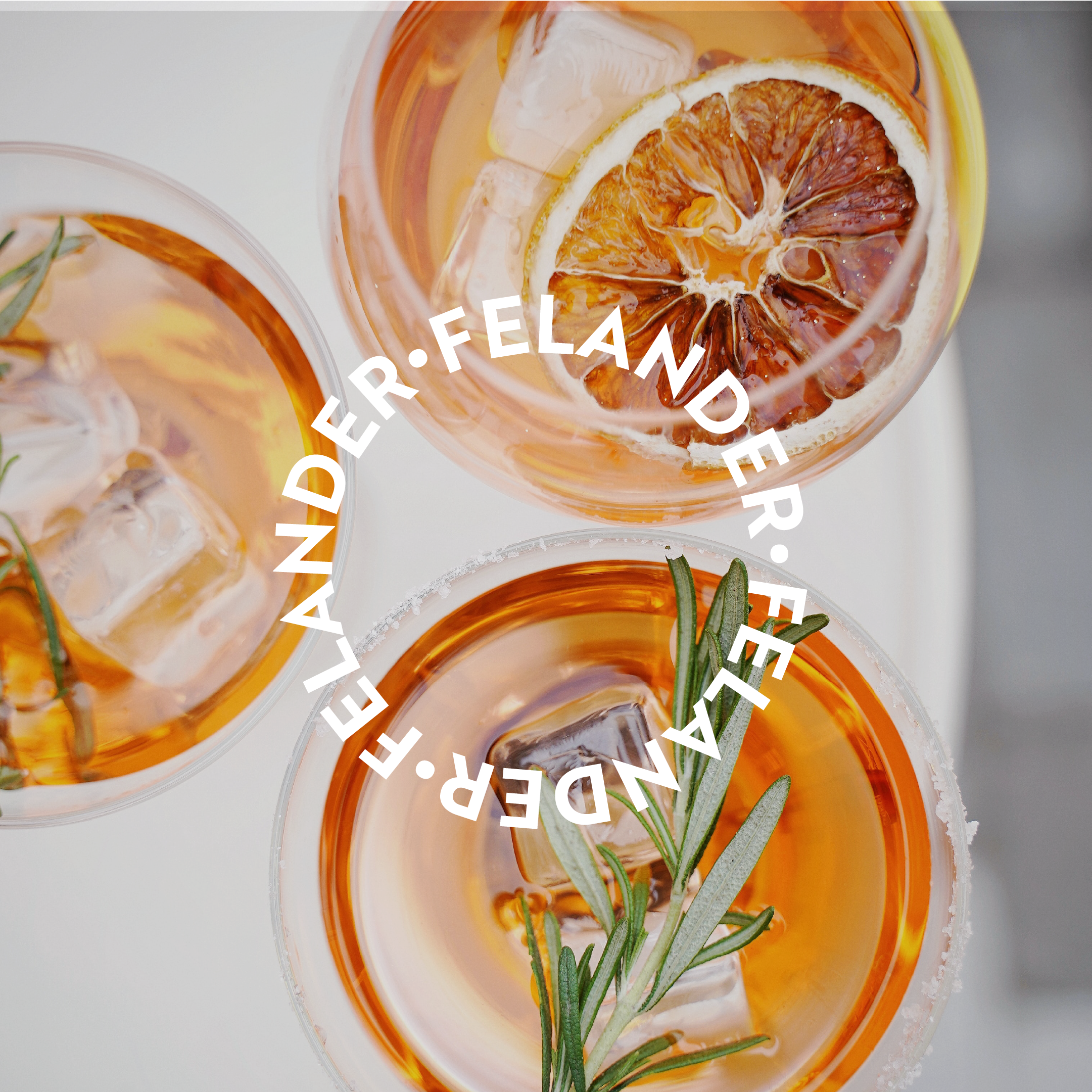
FELANDER
BRAND IDENTITY ● LABEL DESIGN
ABOUT
Felander is a premium Prosecco company that specializes in creating high-quality products for consumers.
PROJECT GOALS
Design a logo and label for an €18 Prosecco bottle that would appeal to people between the ages of 20 and 30. The label must represent joy, conviviality, and rebirth from the COVID pandemic.
PROJECT
After conducting market research, we developed a concept that focused on highlighting the timelessness of Prosecco while incorporating a fun and youthful look and feel. We used a bold color palette and a thick typeface to create a striking design to capture the target audience's attention.
The label design was carefully crafted to represent joy and conviviality, with a nod to the brand's commitment to helping people celebrate special moments. The design also incorporated elements that symbolized rebirth from the COVID pandemic, such as a fresh and vibrant color palette.
The result is a label that successfully represents the brand's values and appeals to the target audience. The bold design and bright colors help the product stand out on the shelf and position Felander as a premium Prosecco brand for young, fun-loving consumers.
DESIGN ELEMENTS SPOTLIGHT
The Illustration
At its core, this illustration embodies the values of conviviality, community, and the art of living in the present moment. Notably, the faces within the illustration remain neutral, devoid of specific age, color, race, culture, or gender markers. This purposeful neutrality makes it universally relatable and appealing to individuals from all walks of life.
The Circle
You'll find a seamless integration of the circular shape throughout the design. The logo, the faces within the illustration, and the label all flow harmoniously around the bottle, mirroring the form of a circle. This design choice was inspired by the captivating nature of bubbles, symbolizing effervescence and evoking the wholesome spirit of Prosecco.


