La Casa Soprana
BRAND STRATEGY ● BRAND IDENTITY ● SOCIAL MEDIA MANAGEMENT ● CONTENT CREATION ● WEBSITE DESIGN
ABOUT
La Casa Soprana is a boutique vacation rental located in the heart of Genova, Italy. It consists of three newly renovated apartments that offer a unique and authentic experience to guests.
CHALLENGE
La Casa Soprana's challenge was establishing a strong and holistic brand experience for its guests and online audience.
PROJECT
To achieve this goal, we conducted in-depth research on trends, competitive analysis, and target personas. Based on these findings, we developed an authentic brand strategy focused on three primary pillars: familiarity, Genovesità, and history.
Using these pillars as a foundation, we developed the brand identity, social media strategy, and website design to create a consistent and engaging brand experience for guests and online followers. The brand's authentic approach aims to connect with guests and reflect the unique characteristics of the city of Genova. By focusing on these elements, La Casa Soprana is able to differentiate itself from competitors and provide guests with a truly memorable experience.
DESIGN ELEMENTS SPOTLIGHT
The towers
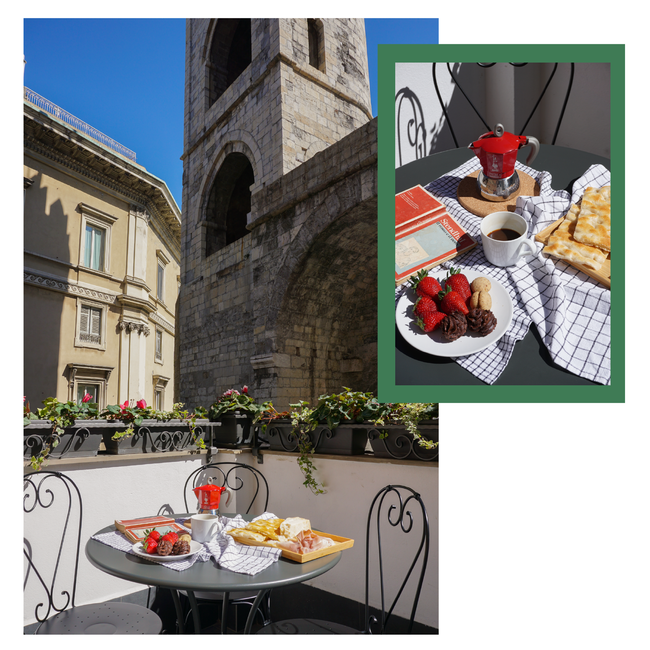
La Casa Soprana offers a unique view over one of Genova's most antique and famous monuments: Porta Soprana. For this reason, it has become the symbol of the vacation rental.
The typeface
Josefin Sans: sans-serif typeface that reflects particularly the simplicity and elegance of La Casa Soprana’s interior design (easily readable)
Big Caslon: the typeface wants to reconnect to the history surrounding La Casa Soprana.
The color palette
The elegant Pantone Green evokes Liguria’s heritage. It represents the raw materials, such as basil, olive trees, and green beans, that grow on the territory and are essential to preparing Genova’s traditional dishes.


