The A-Circuit
BRAND STRATEGY ● BRAND IDENTITY
ABOUT
The A-Circuit was born out of a desire to create an extraordinary experience that goes beyond the traditional idea of networking. The A-Circuit was founded by Nicolas, who has experienced the power of travel and human connection and offers a fresh and unexpected way to build relationships. By organizing events in unique locations worldwide, The A-Circuit connects ambitious professionals who are open-minded, adventurous, and eager to elevate their business through out-of-the-ordinary experiences.
PROJECT GOALS
When I partnered with The A-Circuit, the objective was to craft a brand identity that embodied a balance between exclusivity and approachability. This meant:
Designing a visua identity that resonated with ambitious, global professionals looking for authentic connections.
Capturing a sense of adventure while maintaining a polished, sophisticated aesthetic.
Ensuring the brand felt approachable yet exclusive, welcoming those prioritizing meaningful, high-caliber experiences over status and wealth.
Creating a cohesive brand story that bridged the gap between networking and extraordinary experiences, positioning The A-Circuit as a top choice for professionals seeking unique, impactful connections.
PROJECT
Nicolas approached me to develop a brand that would resonate with world travelers, high-performing professionals, and ambitious leaders who are selective about where, how, and with whom they spend their time. The identity needed to encapsulate both a sense of global adventure and the intimate, human connections that arise in thoughtfully curated settings.
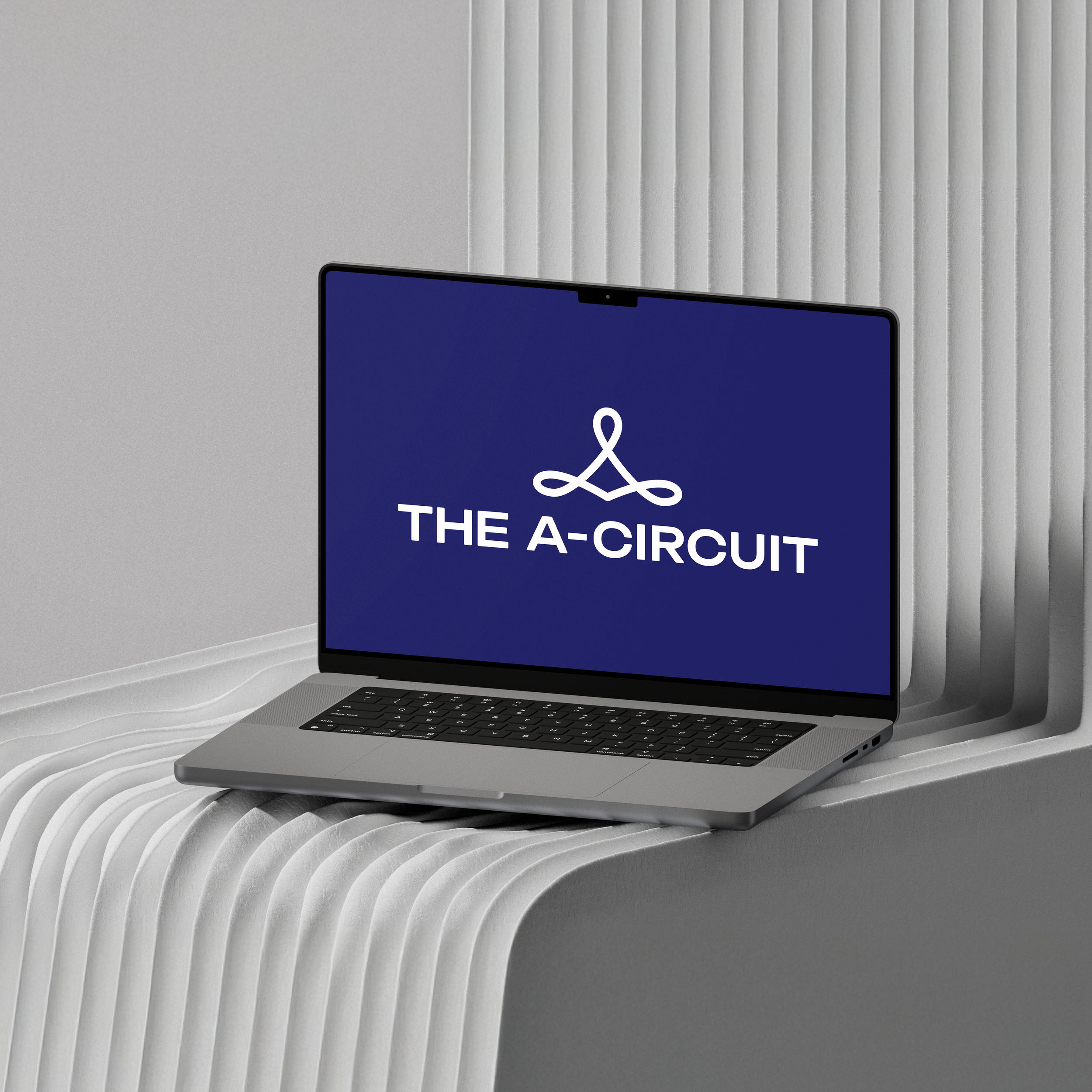
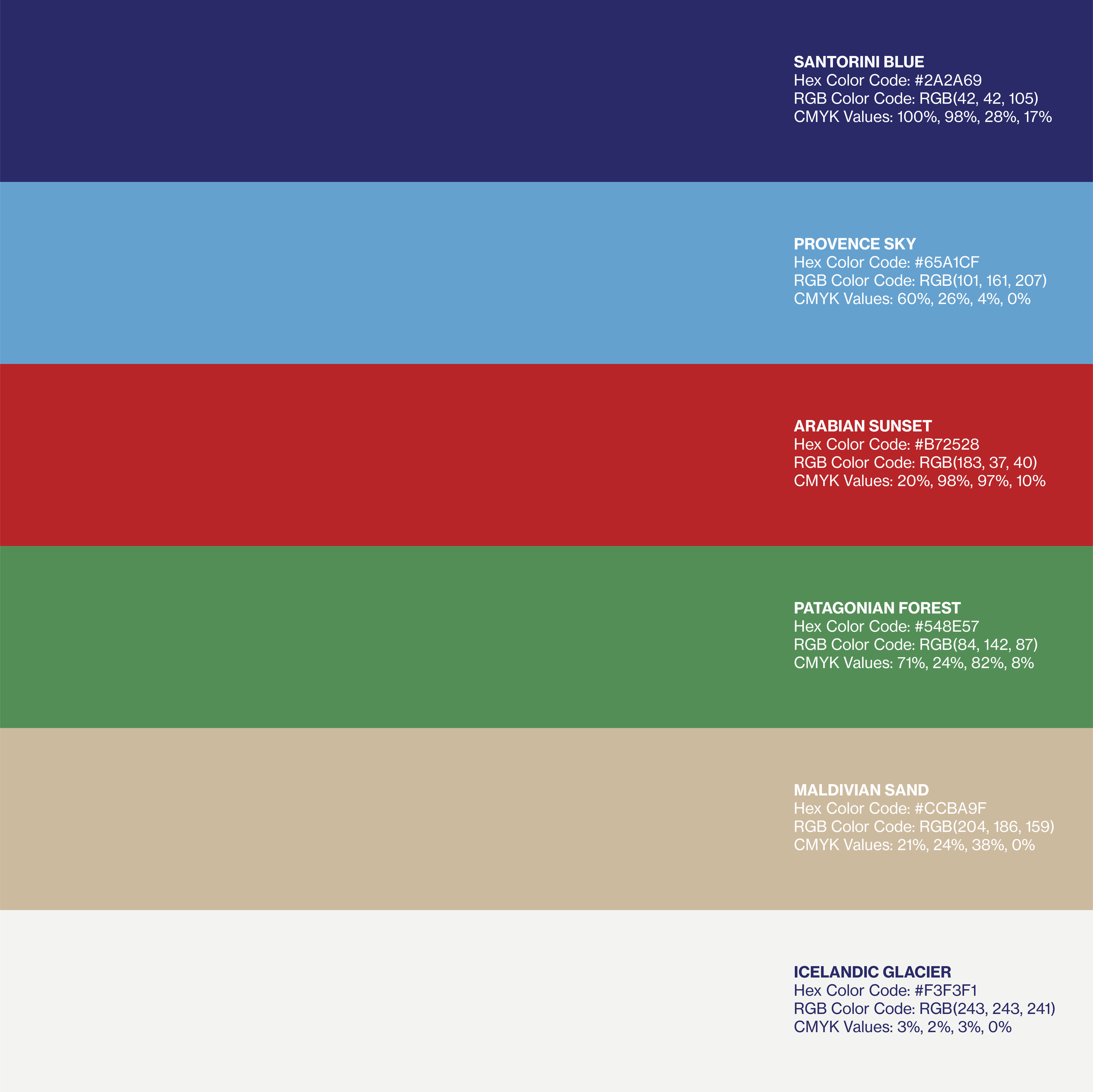
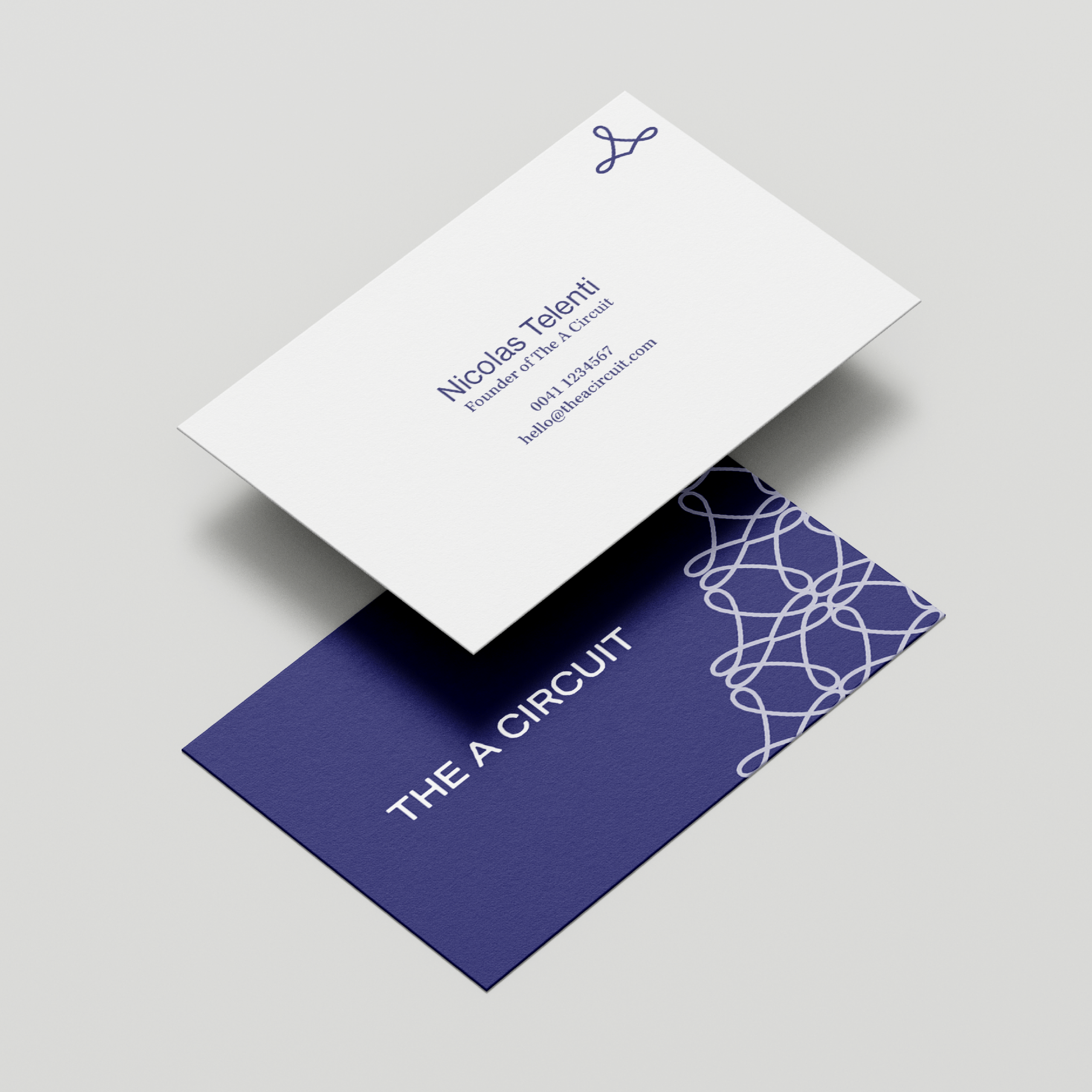
The brand identity began with understanding the “A” in The A-Circuit, which symbolizes "top tier" and the “circuit” as a unique network of people. This insight informed a sophisticated and timeless logo - a monogram with roundness reflecting warmth and community, while sharp, cornered edges in the name conveyed boldness and exclusivity. The visual language balanced vibrant, adventurous colors with dark, elegant tones, inspired by travels to evoke the destinations where The A-Circuit would take place.
Key deliverables included:
Logo & Brand Mark: The monogram logo is a combination of elegance and boldness, symbolizing prestige while remaining welcoming.
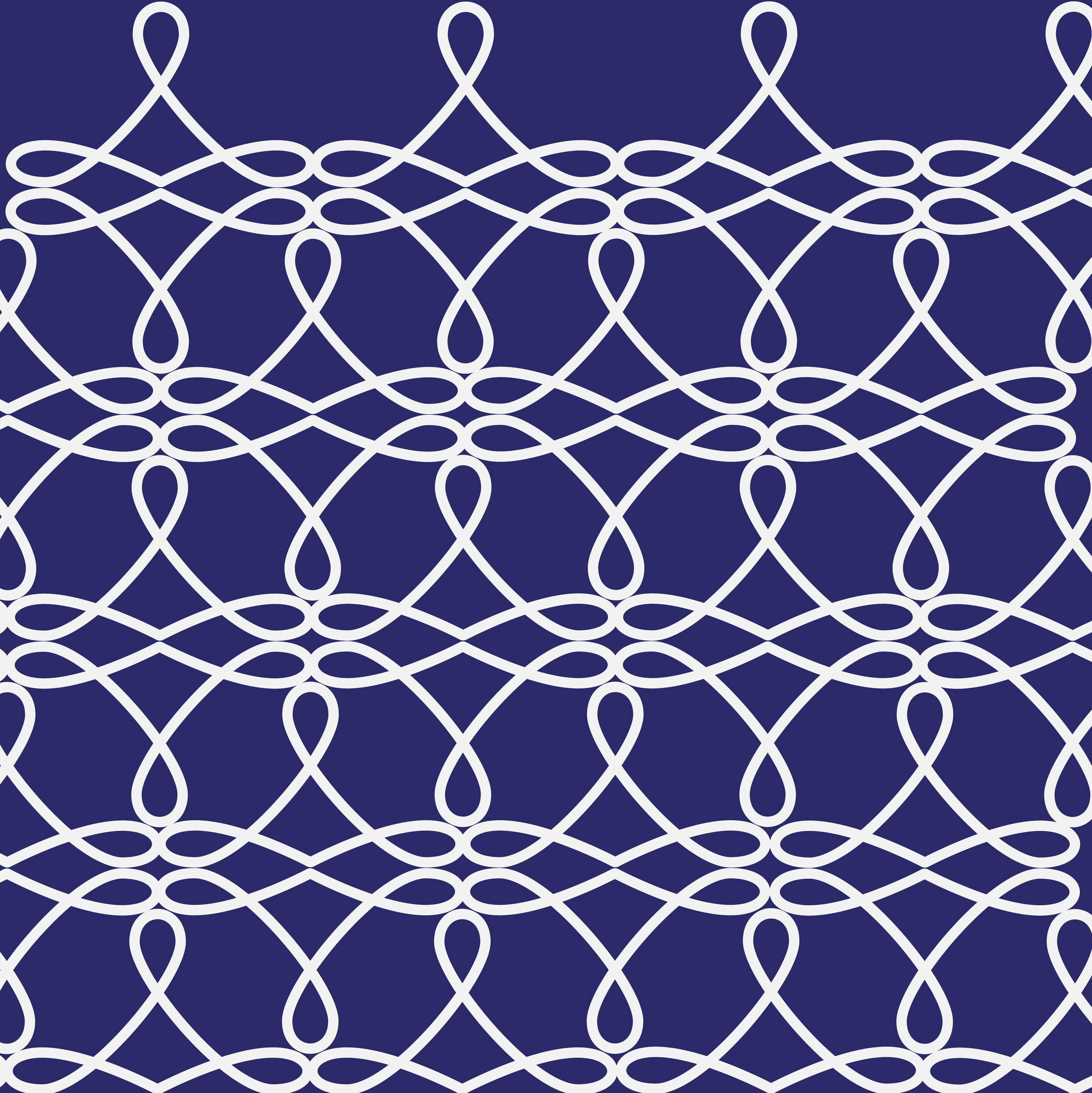
Color Palette: An electric blue grounded by darker tones represented both energy and sophistication.
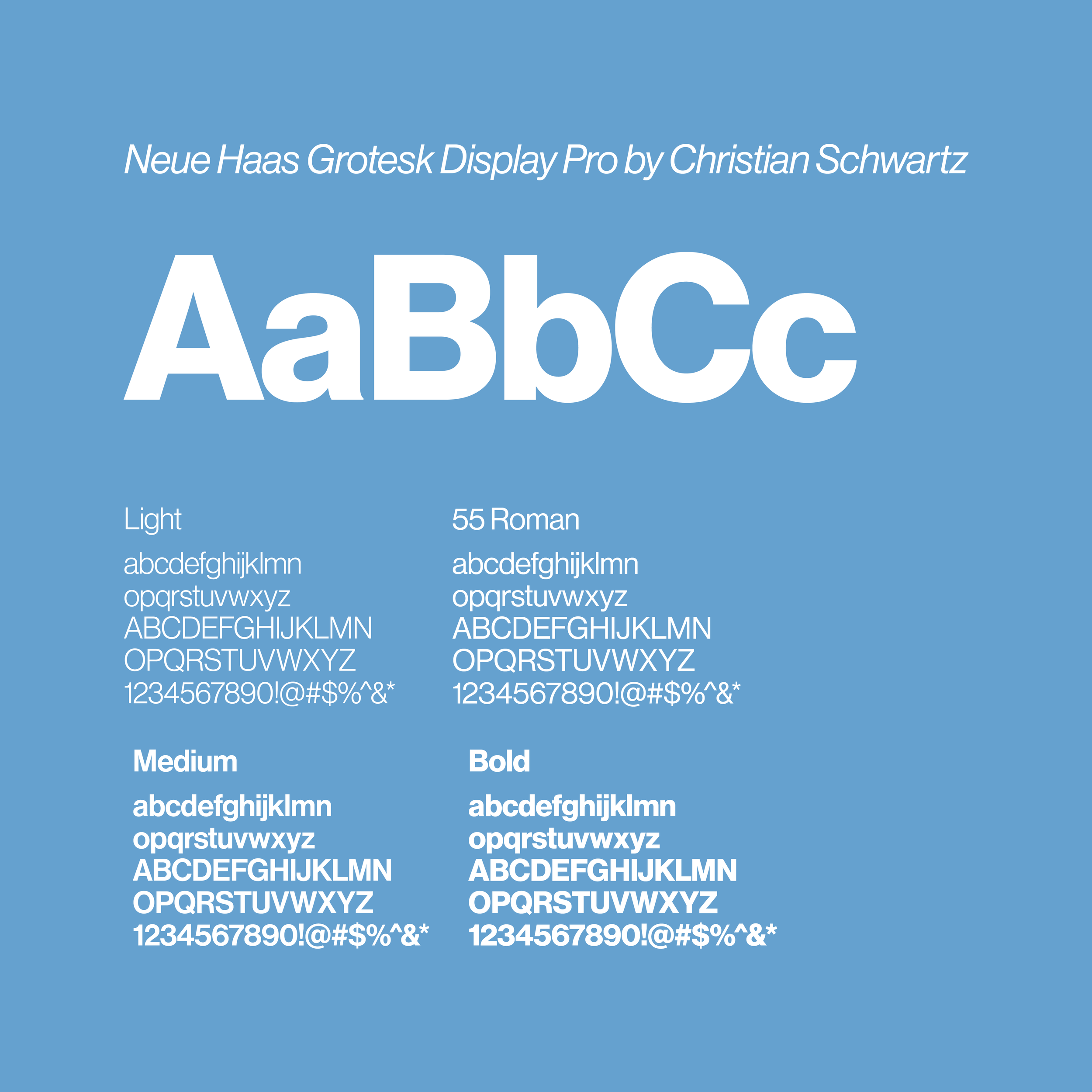
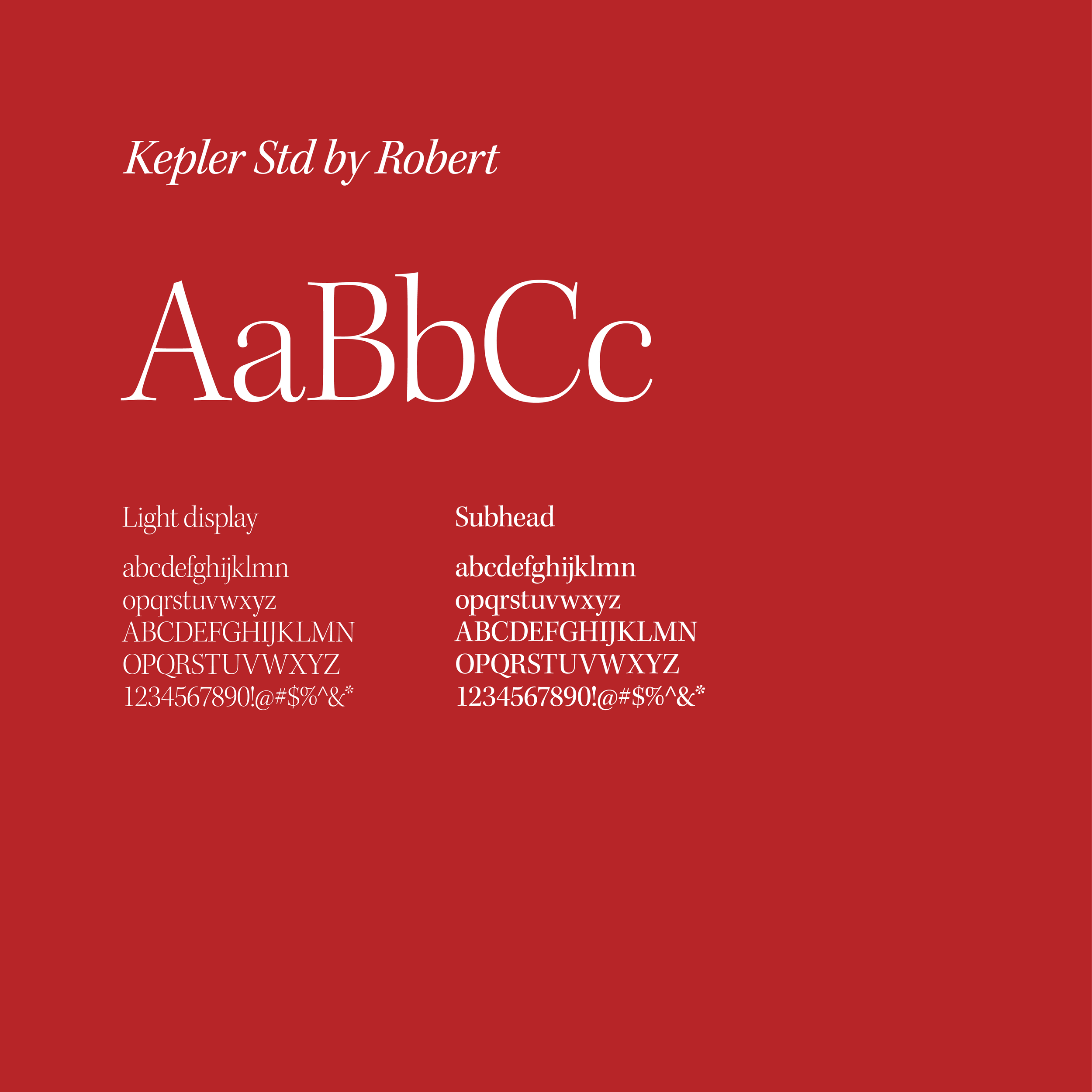
Typography: Selected for both modernity and readability, balancing sans-serif for approachability and a serif font to bring out a classic, luxurious feel.
Brand Book: The brand book detailed the vision, mission, and application guidelines, from typography to colors, ensuring a unified voice across all touchpoints.
The end result is a brand that is rooted in meaningful connections and transformative experiences. By blending luxury with a sense of exploration, The A-Circuit’s identity allows professionals to connect authentically in a world of curated experiences, creating a community defined by its adventurous, ambitious spirit.